Case Study: John Lewis
Dark Mode
Challenge Part 1
Introduction
Challenge Part 1
Introduction
For the John Lewis website & App
I was asked to create a Dark Mode solution for the John Lewis website, IOS and Android Apps.
- Formulate a way for Dark Mode to work on Desktop environments
- Improve & support Dark Mode on the Apps
- To provide written & illustrated guidance for the Apps and Desktop teams
Challenge Part 2
Mobile App –
Muddy Lemons
Challenge Part 2
Mobile App –
Muddy Lemons
I worked with the app designer to develop new solutions
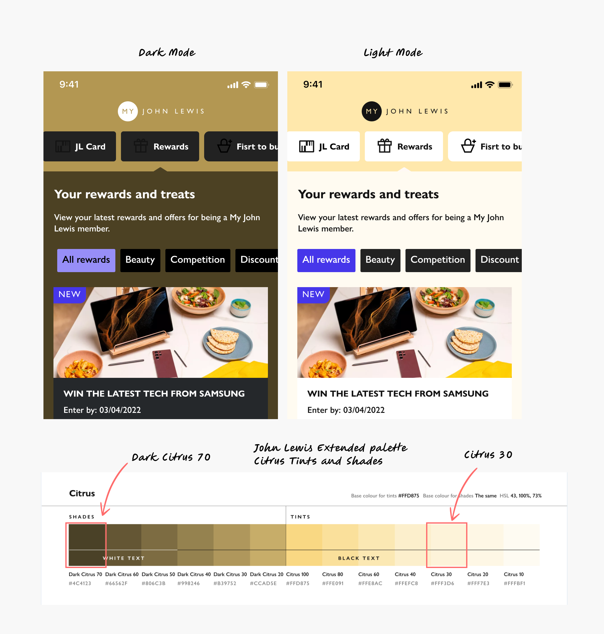
The mobile app was further along in the journey towards Joyfully Bold. Designs had been created.
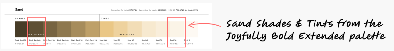
However, anything that was Citrus in Light Mode looked muddy in Dark Mode. Previous designers had chosen shades from the extended palette. There was also a lack of logical, consistent pairing.
Process Step 1
Website Audit
Process Step 1
Website Audit
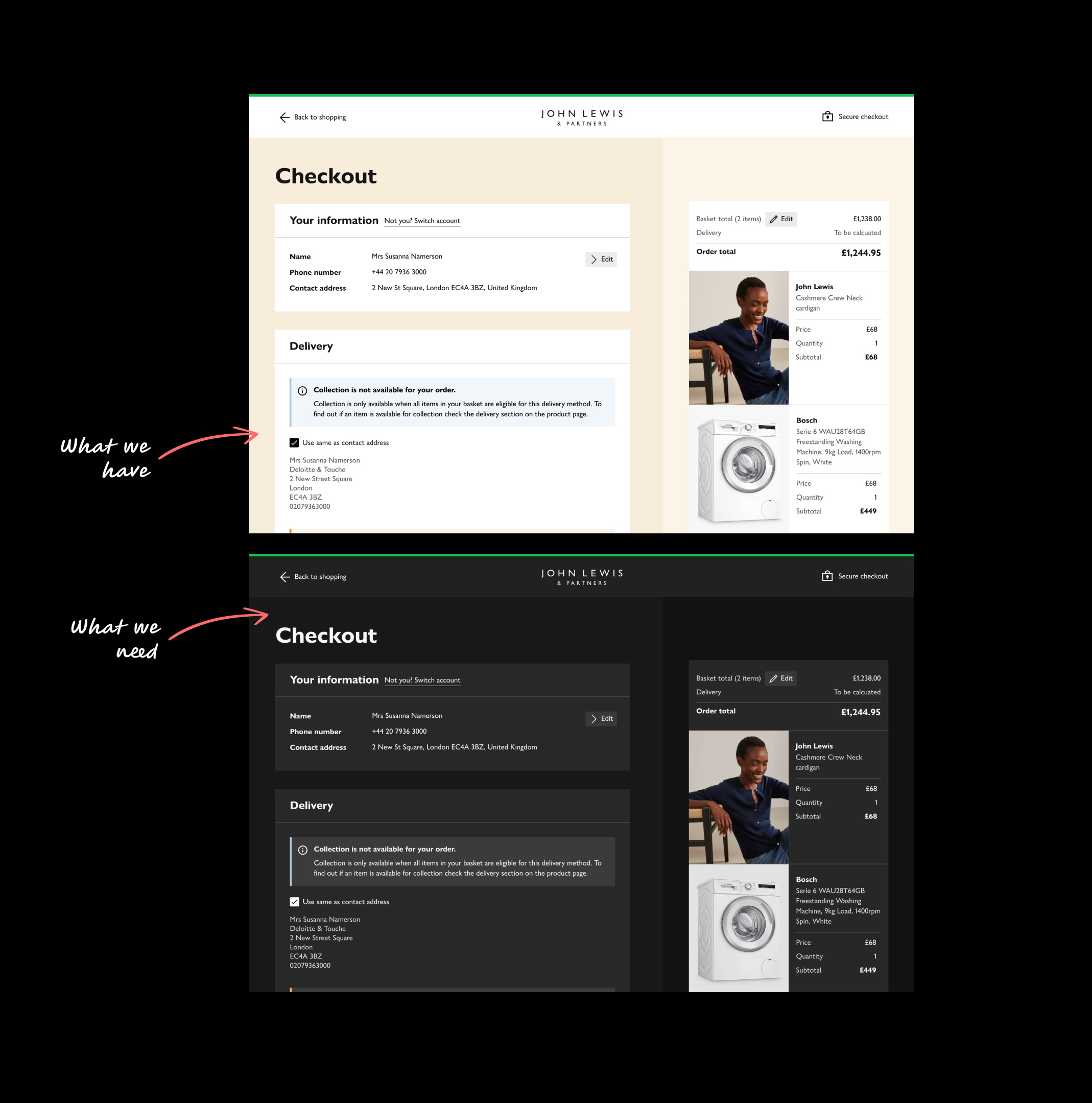
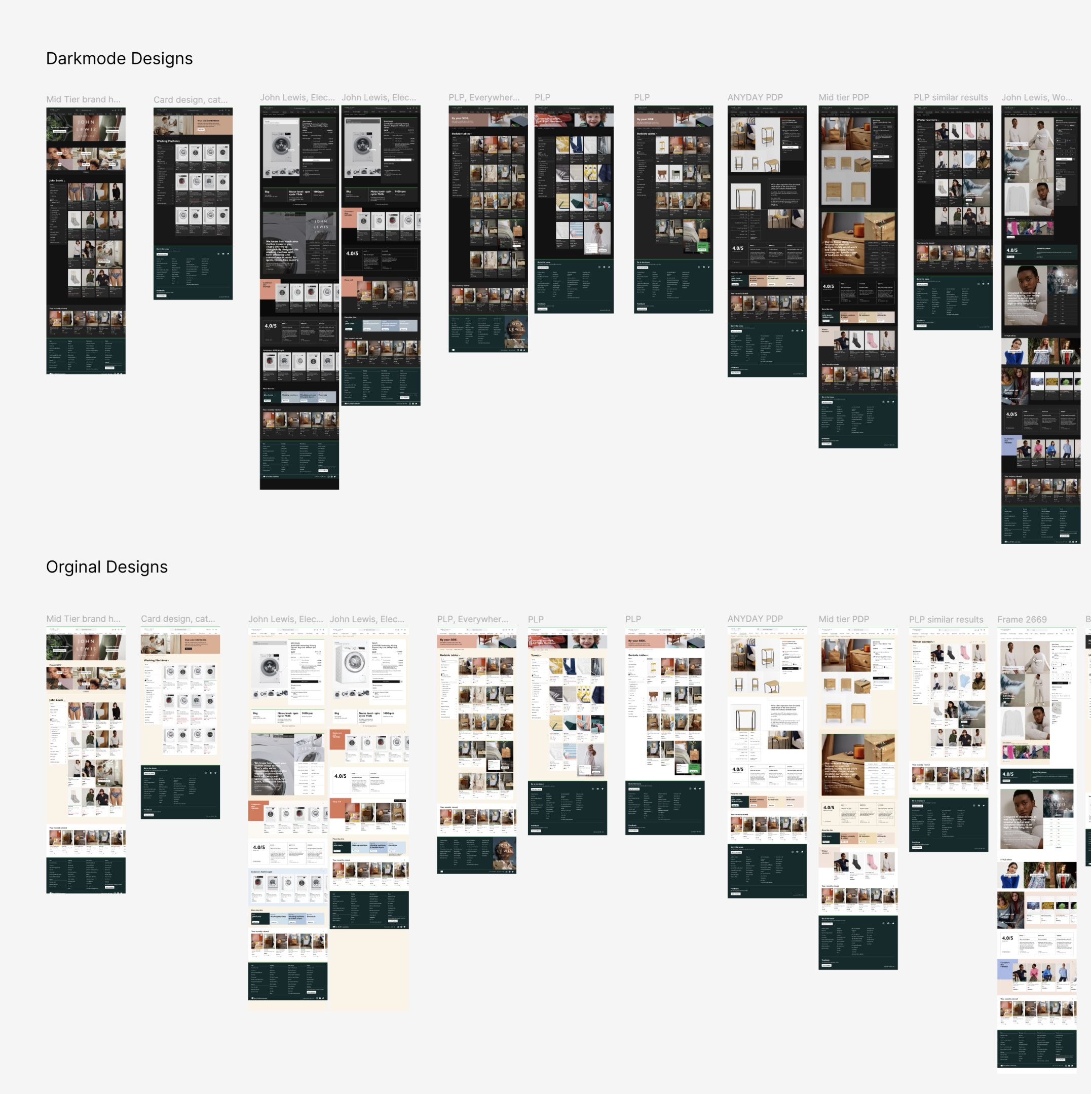
I Created Dark Mode pages from the Original Joyfully Bold Designs
I researched extensively and found plenty of Dark Mode Themes for apps but few for desktop. Many were just Dark Themes, like Netflix, which I realised aren’t the same. Dark Themes are about looks; Dark Mode is about accessibility, reducing eye strain with a low-intensity experience. To test this I needed to audit all pages so:
- I Created a Dark Mode test palette that mirrored the original colour palette
- Before variables were released, I used a plugin to switch between two colours and recreated all John Lewis pages in Dark Mode.
Process Step 2
Messaging
Process Step 2
Messaging
But how would a low-intensity experience work with something that needs to be seen?
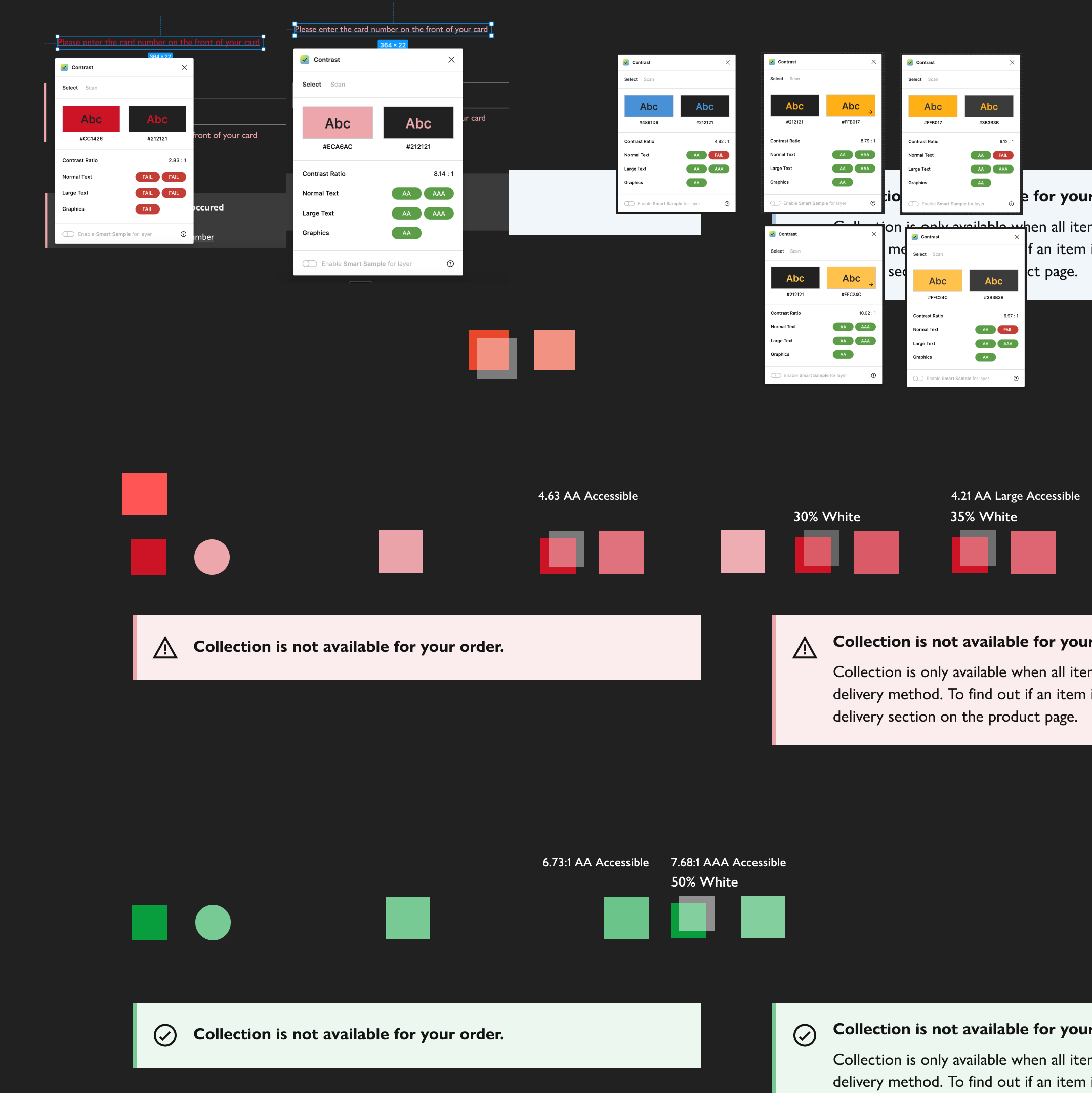
I quickly learnt Dark Mode required more than simple colour inversion. I experimented with semi-transparent white overlays and refined the palette through extensive colour contrast accessibility testing.
The Key was to find a balance between low intensity, aesthetic harmony, legibility and accessibility.
Process Step 3
Opaque or Semi Transparent?
Process Step 3
Opaque or Semi Transparent?
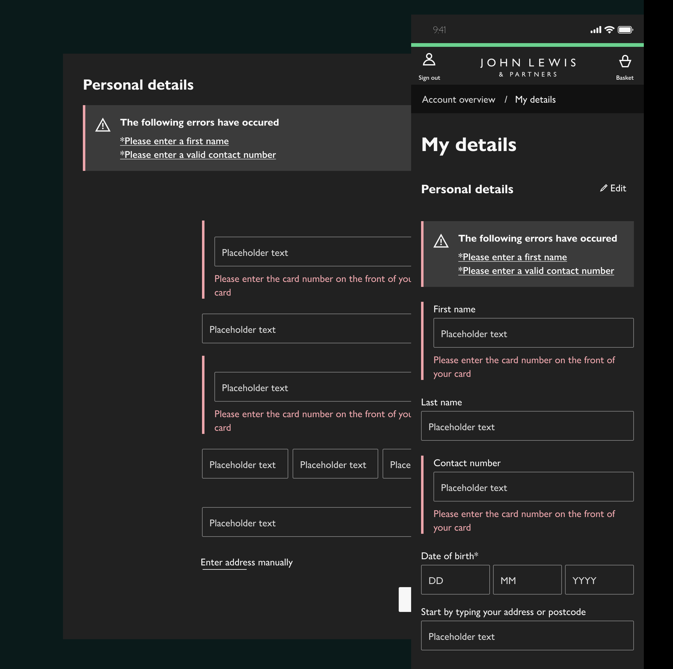
Ensuring Message Legibility Across Variable Backgrounds
Anticipating accessibility issues caused by unpredictable images and colours, I tested message backgrounds extensively. I chose opaque backgrounds to guarantee consistent legibility and meet accessibility standards across all scenarios.

Solution Step 1
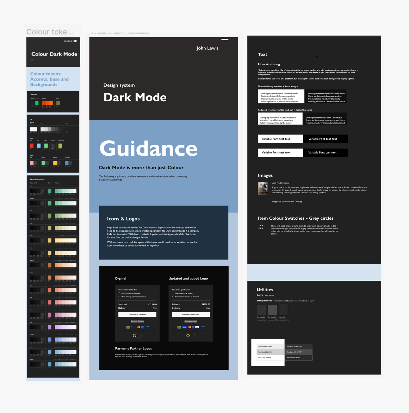
Guidance: Überstrahlung & more
Solution Step 1
Guidance: Überstrahlung & more
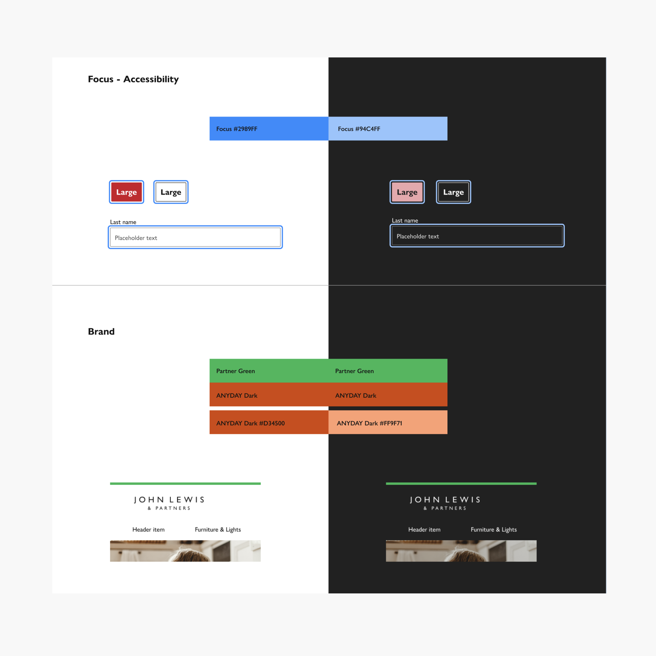
Why dark mode isn’t just inverted colours
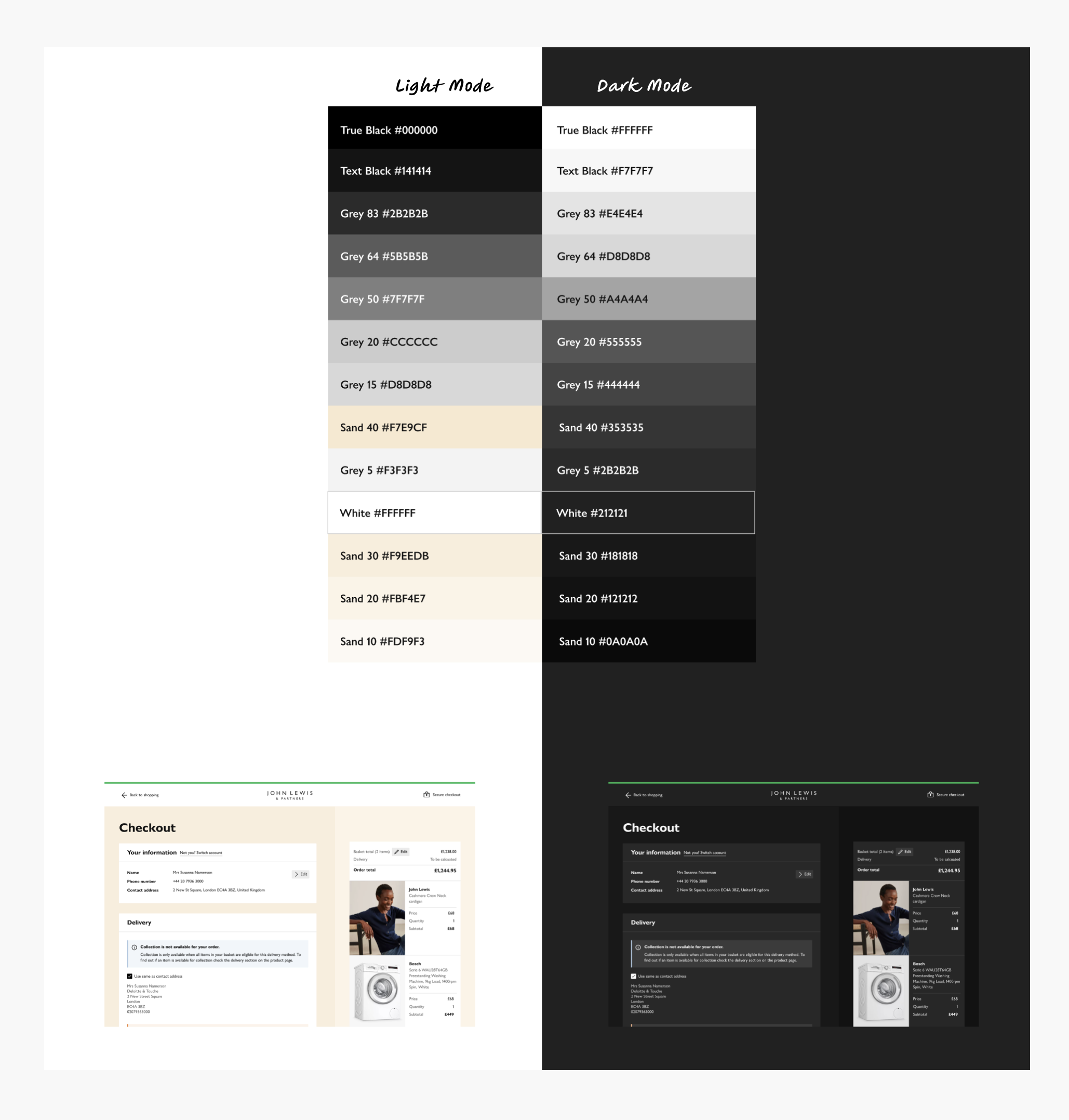
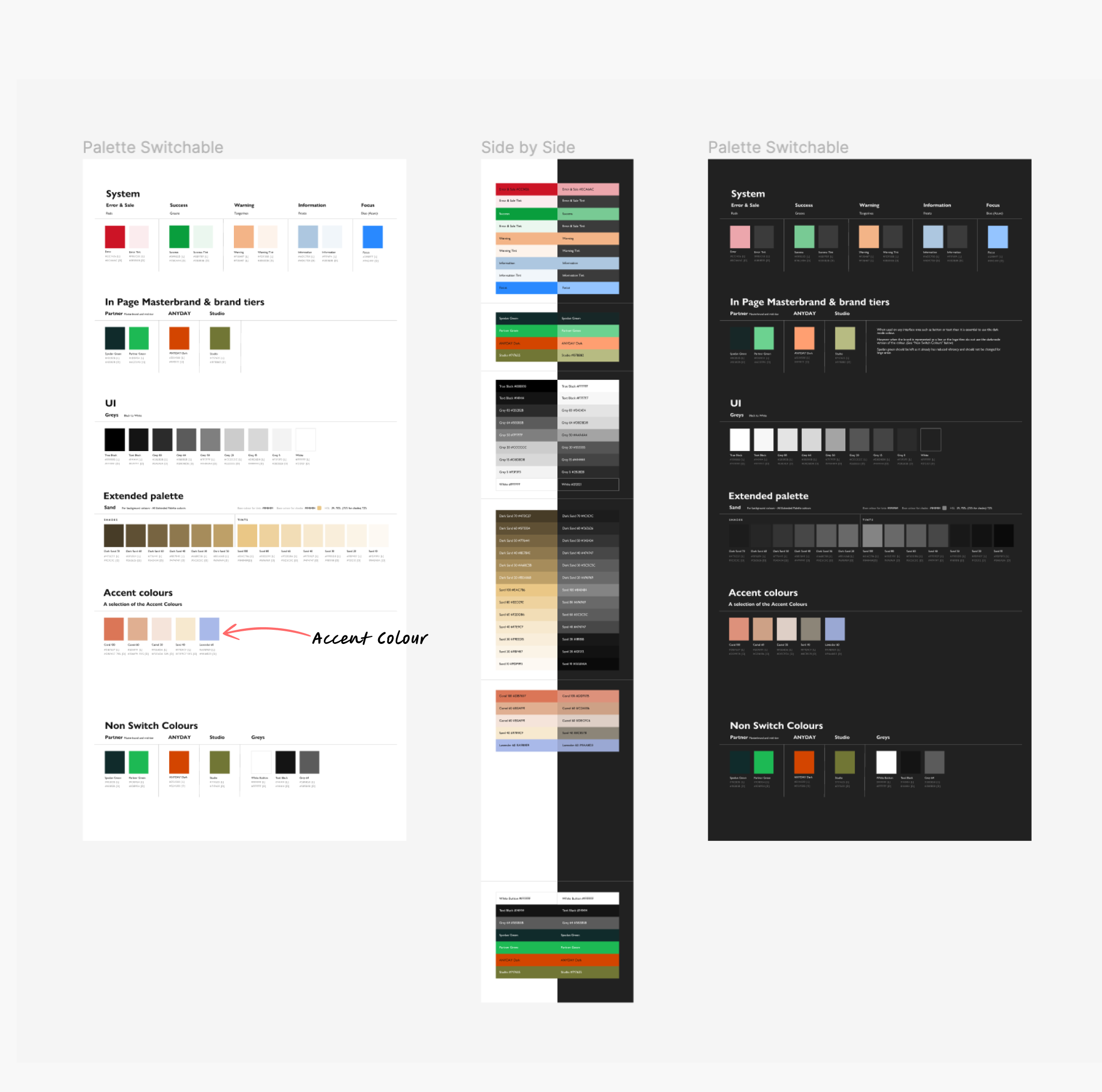
From the learnings, I produced Dark Mode guidance and a complete dark mode colour palette, where to simplify all Shades that are become grey and all tints remain the same with mild tweaks. Grey UI Reverts, signal colours reduce intensity and brand colours do not change.
“Überstrahlung”: bright areas bloom into dark ones, making dark text look thinner and light text look bolder.
Variable font weights + slightly lighter white text used to balance this.
Solution Step 2
Mobile App
Solution Step 2
Mobile App
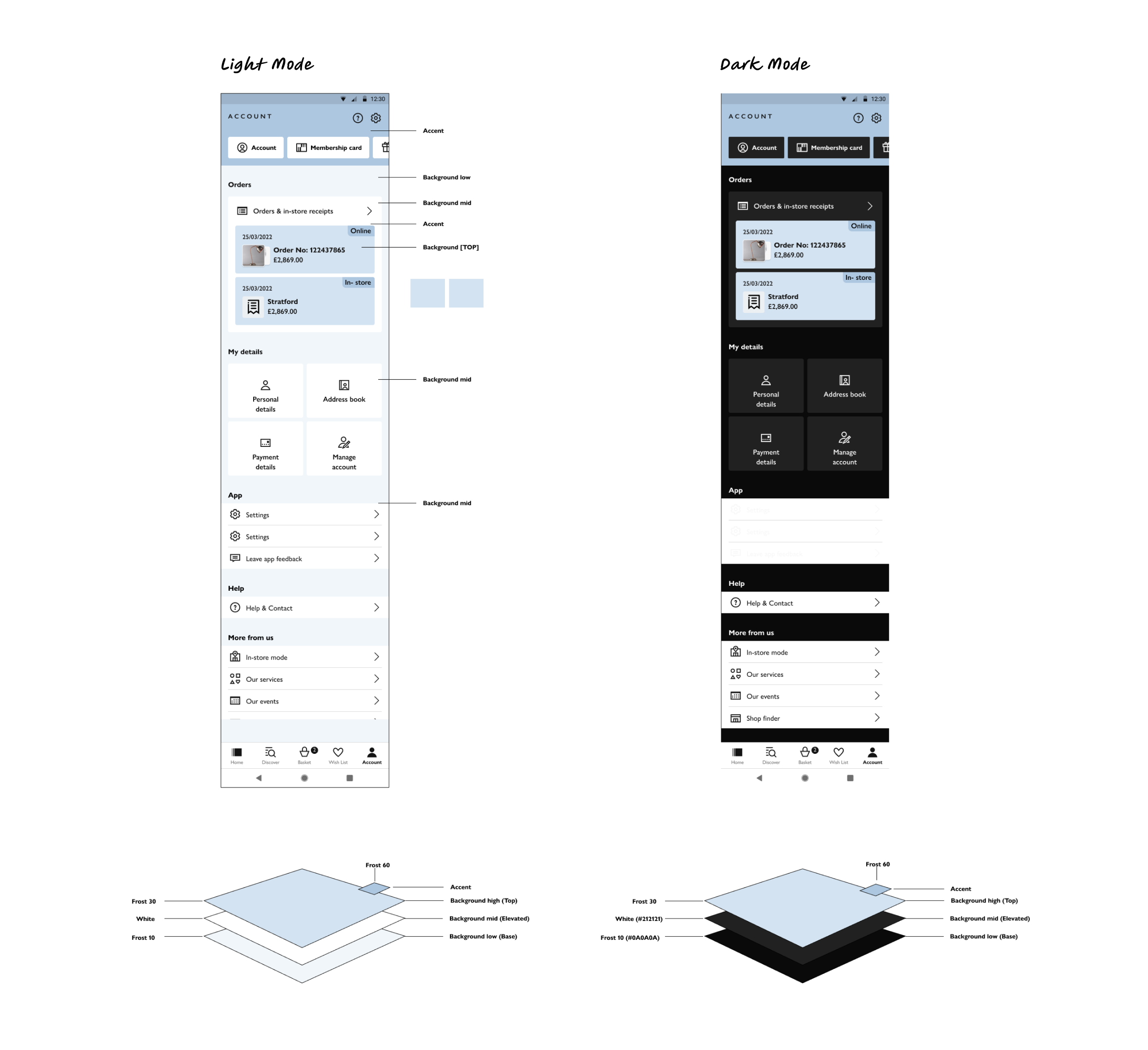
Light and Layers
We also looked at Material design and how light works on layers and was able to apply this concept to our designs in Light and Dark Mode.
It meant clarifying everything a as being on a layer, and systemising. this was extremely helpful when bringing this back into the desktop work and future theming work.
Interestingly enough this idea of light and layers now applies to the new Apple liquid glass concept as well.
Solution Step 3
Guidance: Accessibility and Brand
Solution Step 3
Guidance: Accessibility and Brand
The Brand is Sacred
Accessibility outlines will change but Brand (Partner Green, AnyDay) remain the same, and untouched.
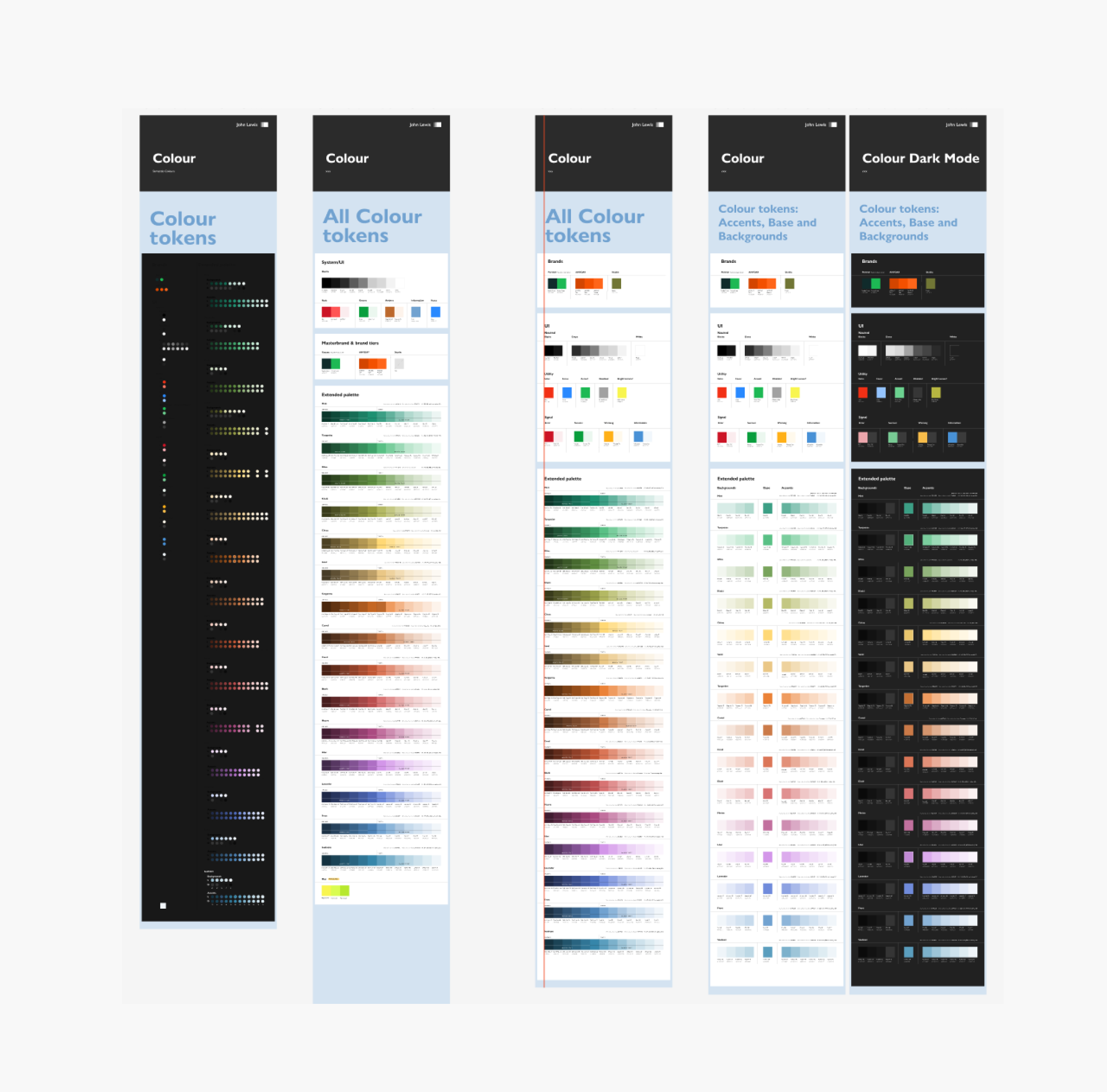
Solution Step 4
Guidance: Extended Palette Backgrounds
Solution Step 4
Guidance: Extended Palette Backgrounds
Areas for improvement
The colour palette for Joyfully Bold needs further tidying up.
There should be a distinction between extended palette and signal colours and semantic language should be used.
Solution Step 5
Guidance: Extended Palette Accents
Solution Step 5
Guidance: Extended Palette Accents
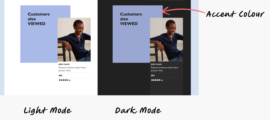
Accents are colours in the foreground of the design
The Accents were the lighter colours and use on blocks, they would not change to grey, but remain or be toned down slightly to keep a certain amount of colour in the design.
Solution Step 6
Messages
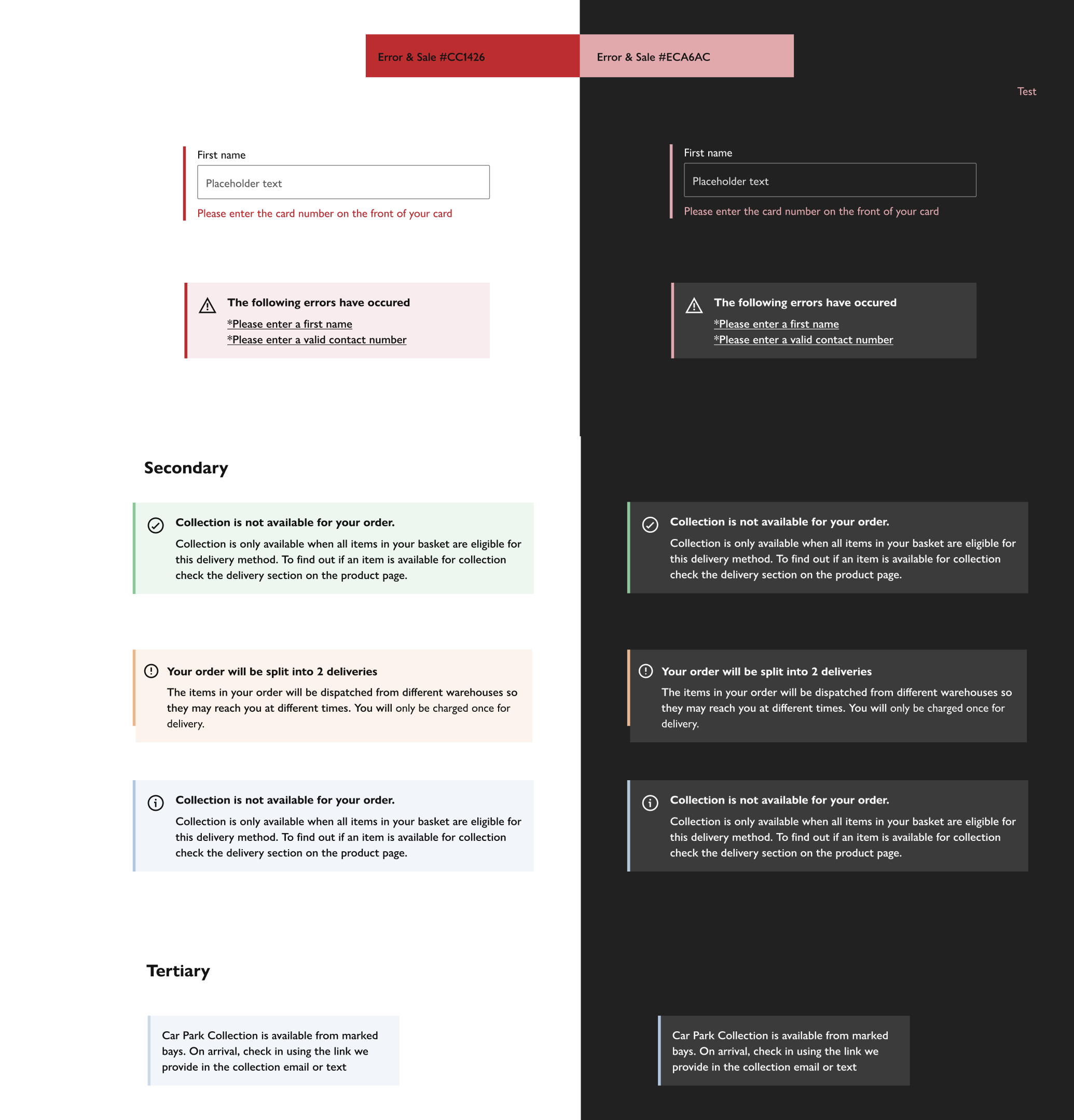
Solution Step 6
Messages
Areas for improvement
From the work on Apps and the work on desktop, the solution was to use layers of grey predominantly, with hints of colour, one thing that struck me was how a number of the colours the yellow and blue were already quite washed out, which worked on Dark Mode but less so on Light Mode.
Messages was the next area of work so I had a great opportunity carry for my learnings from dark mode.
Reflections
Reflections
Lessons learned and observations
The Dark Mode Audit was a great way to see the whole landscape of the Joyfully Bold website.
Dark Mode helped me see the structure and components of a website in a new way – a structure of light and layers.
Dark Mode is more complex than I first thought, but with in-depth research, I came up with great solutions.
In the end Guidance for desktop and support was enough to move everything forward.
Finally, I became acutely aware that we had too many extended palette colours. But with the brand refresh I was able to help find solutions to that as well.