The Client
The Client
As a Senior UI Designer on the John Lewis Design System team, I helped shape the core tools and frameworks used across web and mobile. I worked closely with designers and engineers to ensure consistency, scalability, and alignment across products, while supporting the wider design community during a time of significant change.
I led key initiatives including tokenisation for multi-brand theming (e.g. Waitrose, JL Finance), Dark Mode design as part of an accessibility focus, and system updates during the brand refresh to align with a new visual direction. My work ensured the Design System remained robust, adaptable, and future-ready.
Dark Mode
Dark Mode
I led an in-depth exploration into implementing Dark Mode across John Lewis digital platforms, going beyond simple colour inversion to create an accessible, brand-aligned experience. Starting with detailed research into visual ergonomics and accessibility standards, I developed a layered, semantic approach that respected the complexity of John Lewis’s 150+ colour palette.
This work involved mapping all UI colours, including greys, backgrounds, and messaging tones, to a dark environment while preserving brand intent and AAA/AA contrast compliance. It also introduced key considerations around font weight perception, colour blindness, and brand asset legibility in low-light contexts, ultimately laying the groundwork for scalable theming within the Design System.
View Case StudyMessaging Framework
Messaging Framework
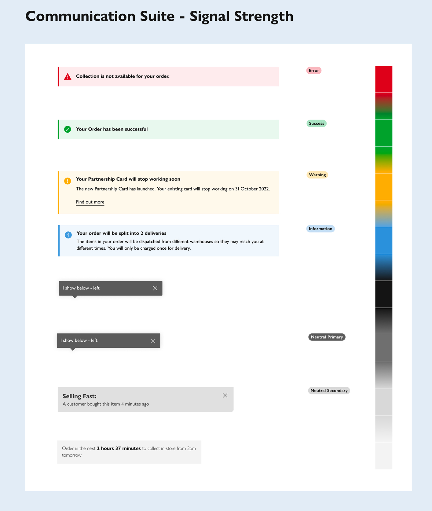
What began as a message box redesign quickly evolved into a complete reworking of the messaging framework across the John Lewis platform. I developed a semantic system based on "signal strength," enabling clear differentiation between critical errors, neutral messages, offers, and informational alerts.
A major challenge was the inconsistent use of reds, such as Sales Red, Error Red, and an accessibility-compliant Orange, all visually similar but semantically different. I conducted an audit across legacy and live designs, defined a consistent colour taxonomy, and created system-wide guidance. The result was a unified, accessible, and scalable messaging system applied across components like toasts, icons, badges, and inline messages.
View Case StudyTheming & Tokenisation
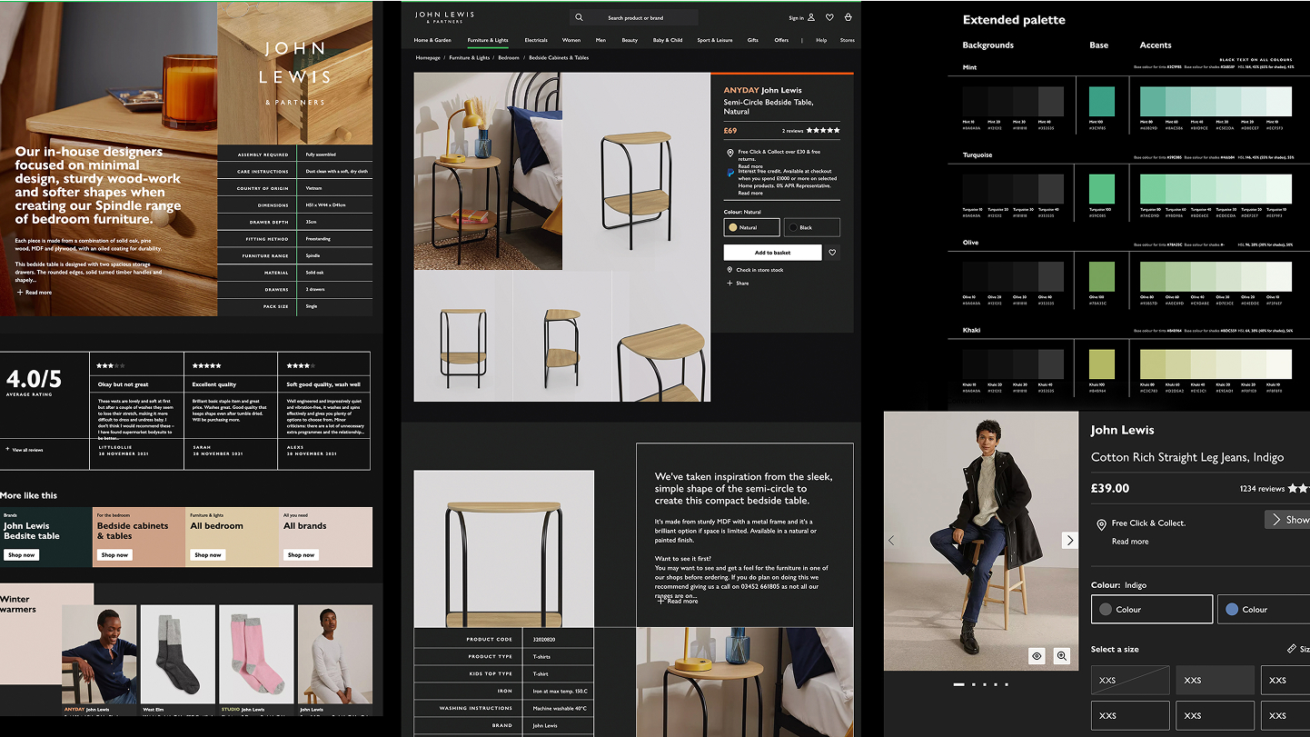
Theming & Tokenisation
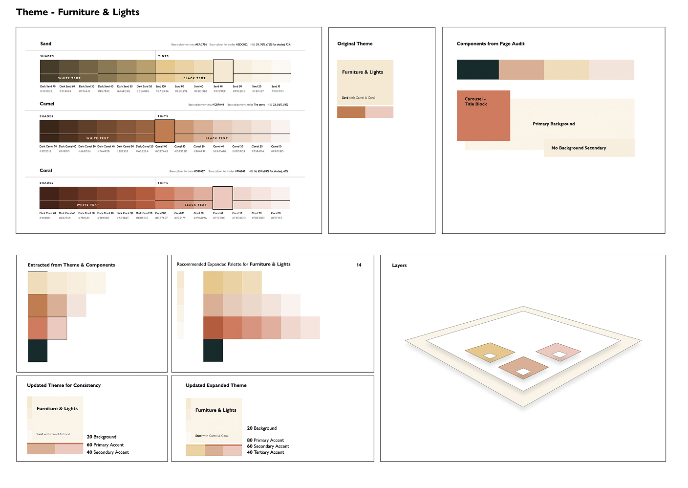
Initially driven by the desire to visually differentiate areas of the site, the theming work evolved into a foundational shift toward a token-based design system. I introduced scalable theming models that could support brand extensions (like Waitrose and Financial Services), seasonal campaigns, and UI flexibility without visual fragmentation.
Working closely with engineering, I proposed and implemented a full tokenisation strategy, defining naming conventions and using Figma Variables to build future-proof components. From background colours to opacity and text states, I transformed static design styles into modular tokens, enabling real-time theme switching and long-term design consistency.
View Case StudyBrand Evolution
Brand Evolution
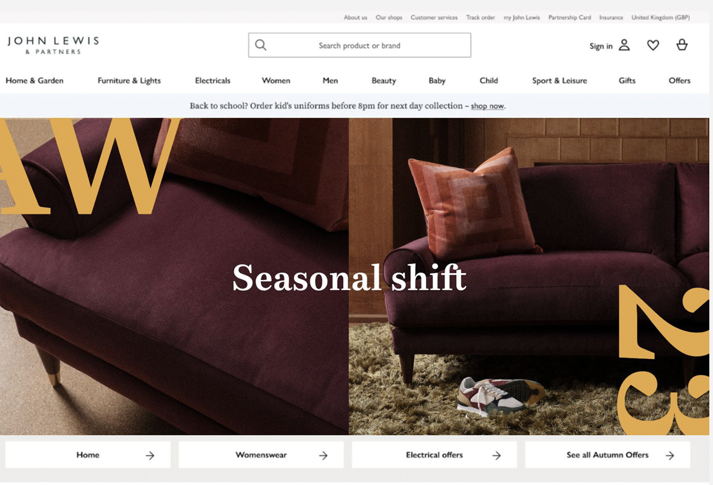
I played a key role in redefining the digital visual identity of John Lewis, modernising the interface while preserving brand warmth. The brief called for a move away from decorative, colour-heavy visuals, without reverting to the cold minimalism of the past. I introduced and mapped the Coral Grey palette to replace the older Sand tones, creating a calmer, more editorial foundation.
During this work, both the brand update and tokenisation programme were under NDA. I strategically advised teams on forward-compatible design choices, helping guide the business through a quiet transition. This resulted in a cleaner, more accessible, and fully integrated visual language, ready for flexible, scalable, cross-brand design in the years to come.
Conclusion
Conclusion
I played a key role in redefining the digital visual identity of John Lewis—modernising the interface while preserving brand warmth. The brief called for a move away from decorative, colour-heavy visuals, without reverting to the cold minimalism of the past. I introduced and mapped the Coral Grey palette to replace the older Sand tones, creating a calmer, more editorial foundation.
During this work, both the brand update and tokenisation programme were under NDA. I strategically advised teams on forward-compatible design choices, helping guide the business through a quiet transition. This resulted in a cleaner, more accessible, and fully integrated visual language-ready for flexible, scalable, cross-brand design in the years to come.