Case Study: John Lewis
Messaging
Introduction
Introduction
Messaging for the John Lewis website & App
Initially I was asked to complete a Design Solution for the messaging components for the John Lewis Design System, serving website, IOS and Android Apps.
It became much more than that.
Challenge 1
Let me show you the Before and after
Challenge 1
Let me show you the Before and after
Brand, accessibility, and system gaps to solve
- Signal colours inconsistent with Joyfully Bold
- No dark mode or theming support in the system
- Early colour contrast and accessibility concerns
Challenge 2
This is why it needed to change
Challenge 2
This is why it needed to change
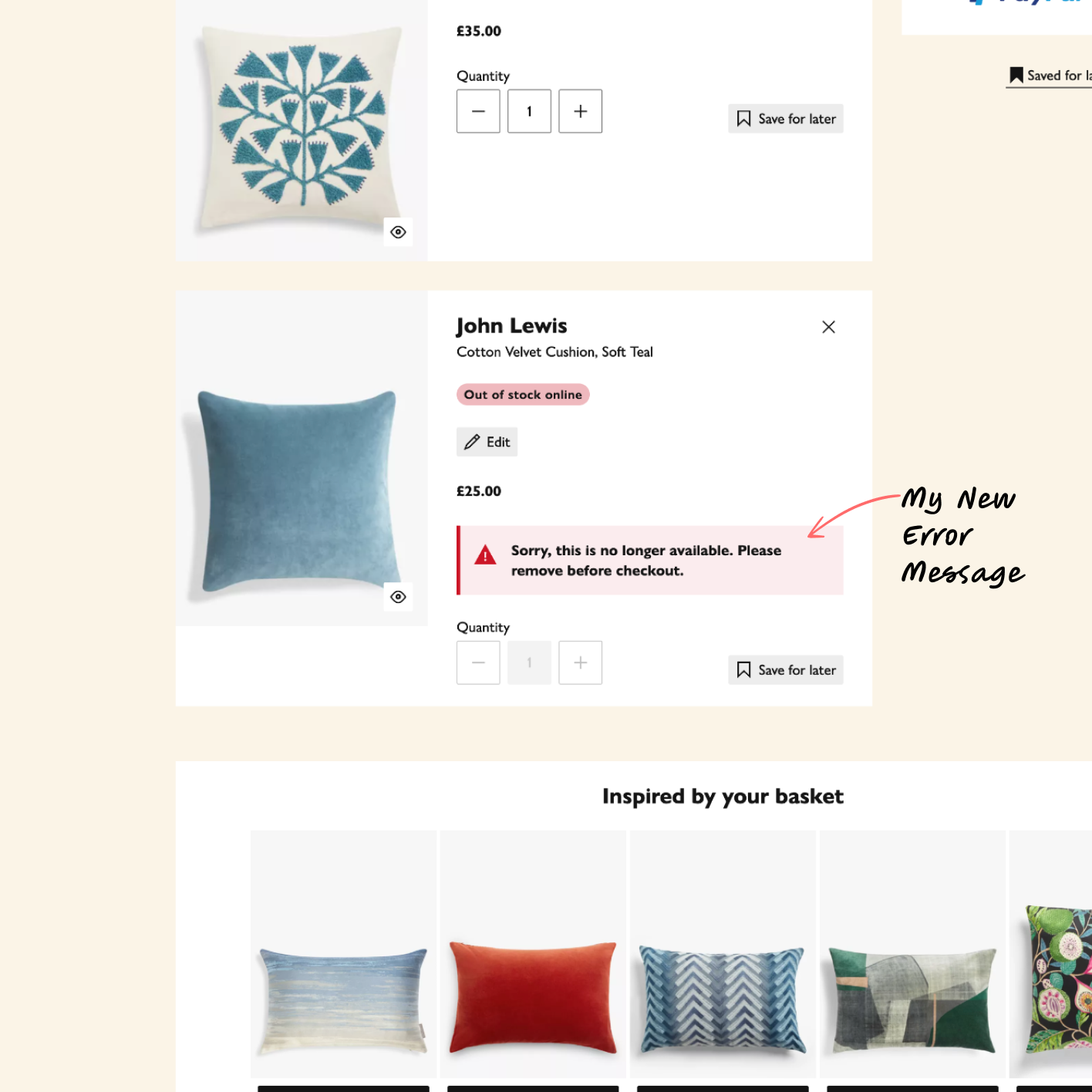
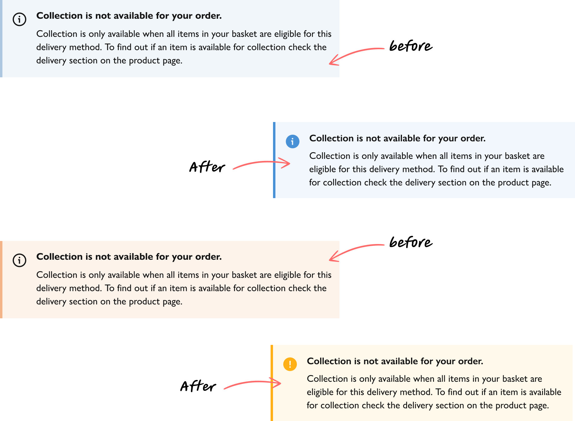
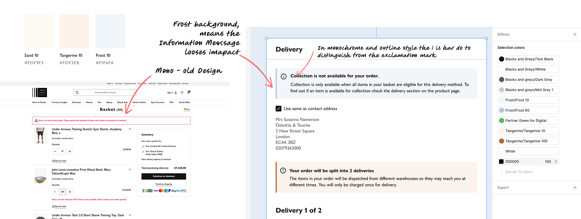
With the new Joyfully Bold design using background colours of Sand and Frost, it meant that the info and warning message lost impact.
Challenge 3
Initial Challenges
Challenge 3
Initial Challenges
Contrast, clarity and boldness
- Thin outlines failed at small sizes → confusion
- “i” vs “!” unclear in critical messaging
- Mono focus design disappears in new Joyfully Bold Designs
- Lack of distinct Messaging colours
Process 1
I took step back
Process 1
I took step back
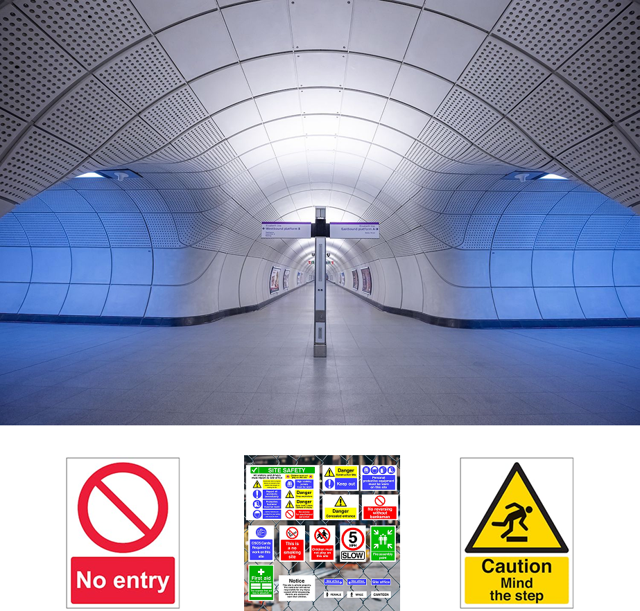
Looking at real-world messaging
Before starting my work at JL I had fascinated by the work on the Elizabeth line with Signage as well as the colour of lighting - warm and cold to guide people to places they should be. So I looked outside the Digital UI world to health and safety signage.
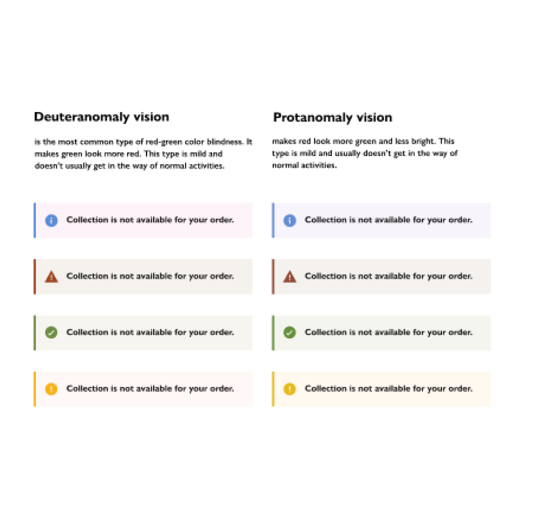
- Colour blindness simulation on existing icons confirmed issues
- WCAG contrast testing failed for outlines
- Findings informed redesign direction
- Referencing real work messaging systems such as Health & Safety signage
Process 2
Accessibility Testing
Process 2
Accessibility Testing
Brand, accessibility, and system gaps to solve
Test for all forms of colour blindness, to test that new icons were more distinctive than before even with reduced colour or none.
Process 3
Red and Red and Red
Process3
Red and Red and Red
Error, Sale and AnyDay
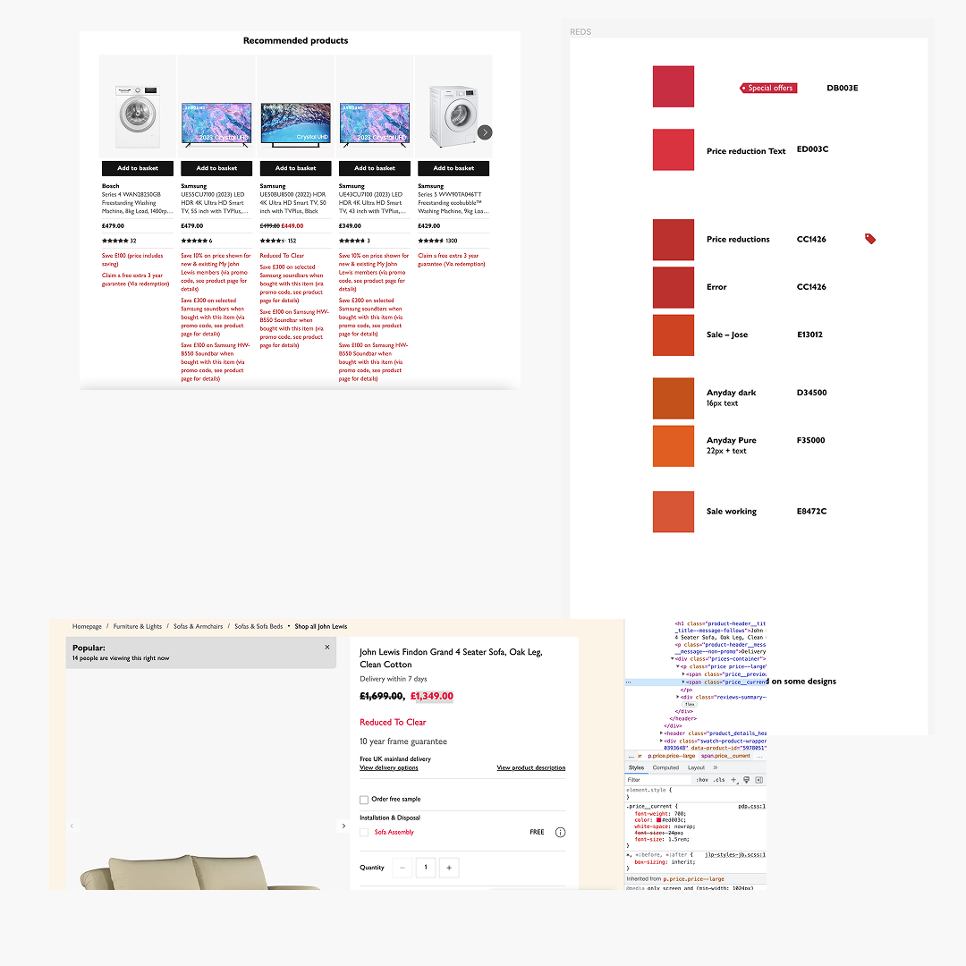
In the process to making the signal colours distinct so that the colours have meaning beyond decoration I look at red as there were obvious issues around sale, error and the darker version of the Anyday orange.
Too much uncontrolled red was a great reason for badges - more of that later.
![]()
Process 4
Icons - Improvements
Process 4
Icons - Improvements
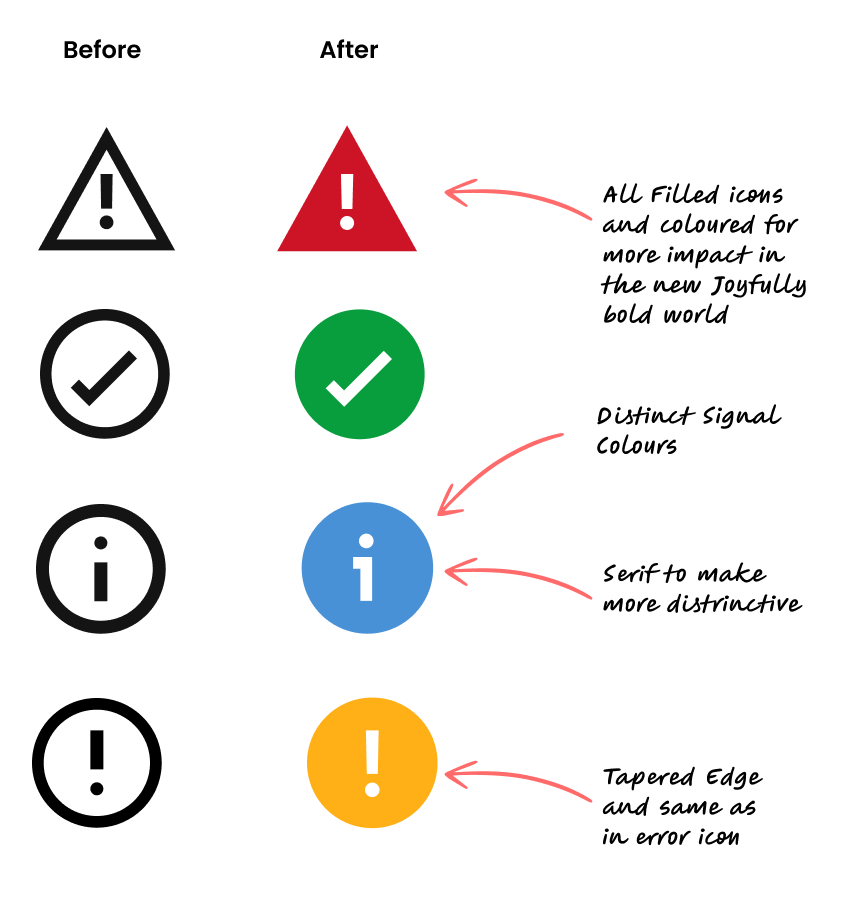
Adding distinctive attributes to improve monochrome and small size legibility
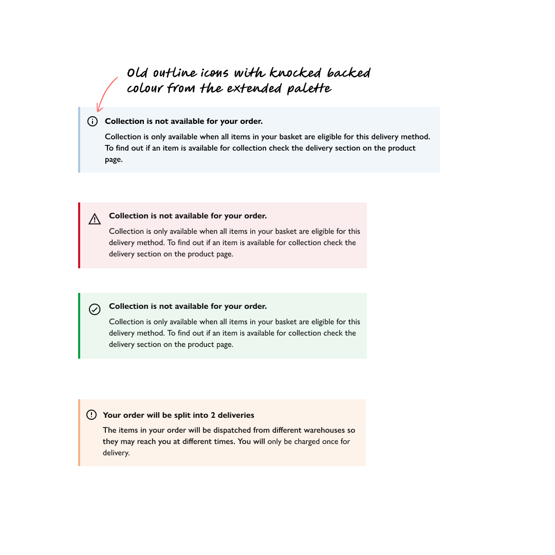
- Tapered “!”, serif “i”, filled icons, Joyfully Bold refinements
- New colours chosen for accessibility & brand alignment
- Distinct from the Extended Palette (Frost 10 is no longer used for Information)
- Post-redesign tests confirmed clarity at small sizes
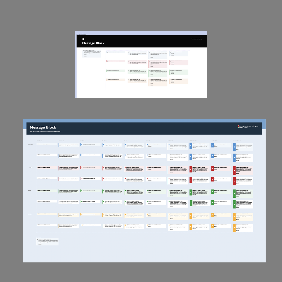
- Distinct Signal Colours
Process 5
Visual Refinements – Signal Colours
Process5
Visual Refinements – Signal Colours
Unified Messaging Language
The New suite of Messaging variations allowed for greater flexibility and refined choice of options for designers when using the messaging component, this also fed into a wider initiative to unifying the messaging components and the visual language used. Bringing into play the idea of signal strength.
Reflections
Live Rollout
Reflections
Live Rollout
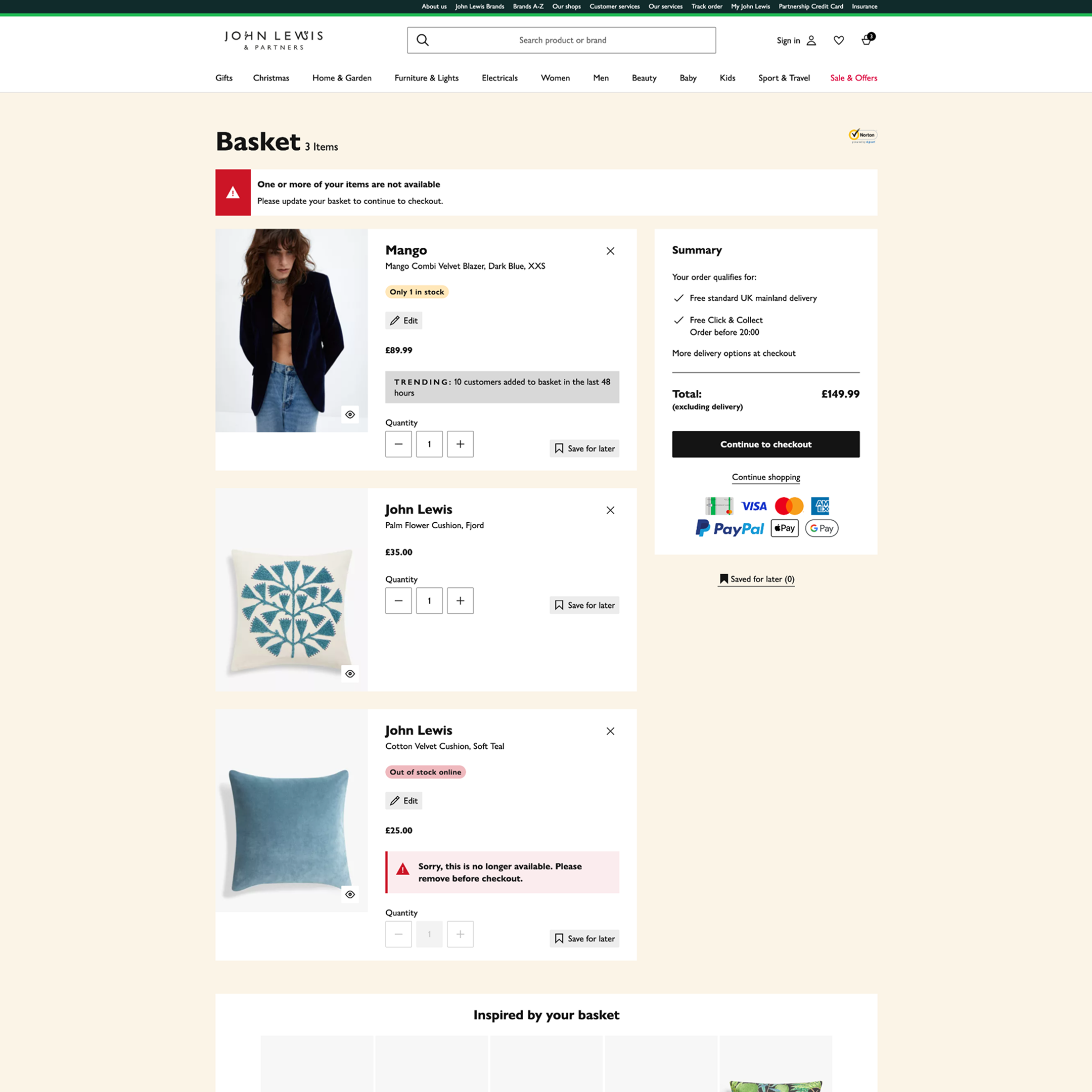
Messaging now powering John Lewis products
- Deployed across desktop, mobile, and apps
- Reduced developer overrides and improved adoption
- Consistent Messaging language, including badges and Toast popups